Curious on how you can integrate interactive Visio diagrams in your Power BI reports? Check out this blog post for a detailed walk-through. To top it off, we'll also include the brand new what-if-analysis feature in the mix.
In this blog post we take a look at two new features in the Microsoft Power BI product: the integration of Visio diagrams as a new visual and the ability to create “What If?” scenarios in your Power BI Desktop models (which explains the bad pun in the blog title).

Setting the Scene
If we want to use a Visio diagram in our Power BI repots, we have to create one of course. To keep it simple, I created this small organization chart in Visio:
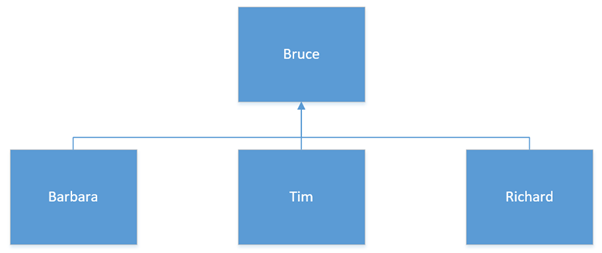
It represents a department where each employee is responsible for sales. Some sample data:
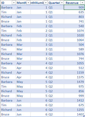
The ID column of the sample data corresponds with the text inside the shapes of the Visio diagram. This is important when we want to have these mapped automatically in Power BI Desktop. The Visio document is stored in a OneDrive for Business account. This is important as Power BI needs access to this document.
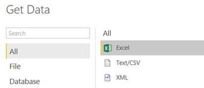
Let’s import our sample data into Power BI Desktop. We choose Excel as the source of the data:
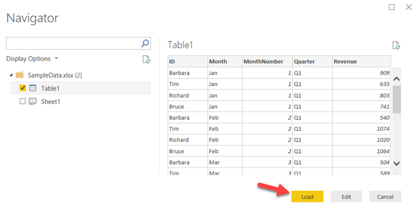
After picking the Excel workbook in the navigator, we select the table and load it directly into the model.
Next, we’re going to define the data model a bit further. Let’s sort the month according to the month number, instead of alphabetically.
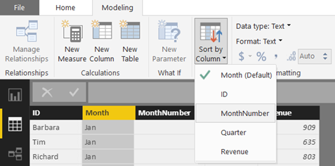
We’re also adding a measure with the following formula:
NetSales = SUM(Revenue) * 0.9
At the moment, we’re offering the customers a 10% discount. The last step is to import the custom Visio visual into Power BI Desktop. The easiest way to do this is through the store (make sure you have updated Power BI Desktop to the latest version):
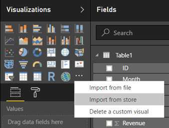
Simply click on Add to have the visual imported.

Now we can start building our report.
Adding the Viso Visual
First, add the visual to the canvas by simply clicking on the icon.
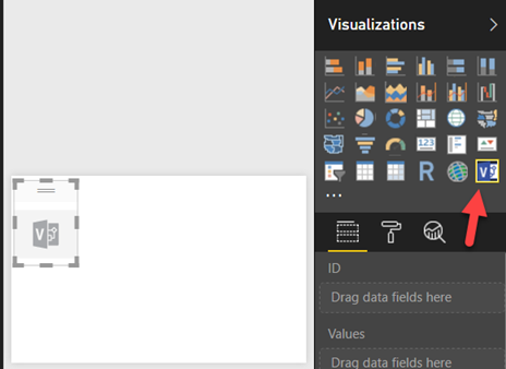
The next step is to specify the mapping between the shapes and the data. We can do this by dragging the ID column from our sample data to the ID field of the visual.
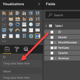
The visual will now ask for the URL to the Visio diagram. You can find this URL by navigating to the OneDrive for Business folder and opening the diagram in the browser. This will launch Visio Online. You can simply copy paste the URL (which should contain WopiFrame.aspx) from the browser.
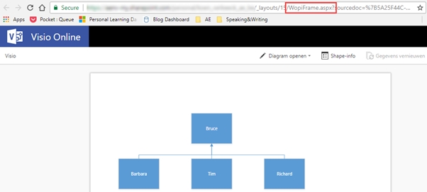
It’s possible you have to log into OneDrive for Business. Finally, the diagram is shown in Power BI Desktop:
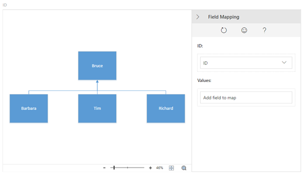
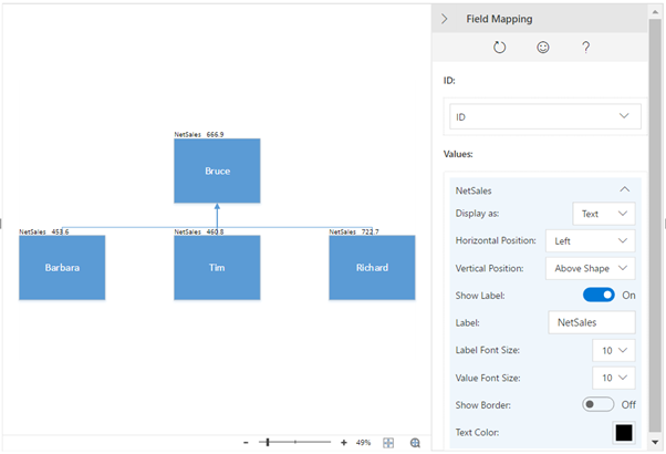
Now we need to specify a measure for the Values property. This will be the NetSales measure. The visual will add this measure as text:
However, we want it to color the shapes instead. Let’s change “Display as” to Colors and specify some ranges for the different values:
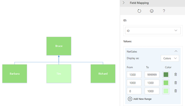
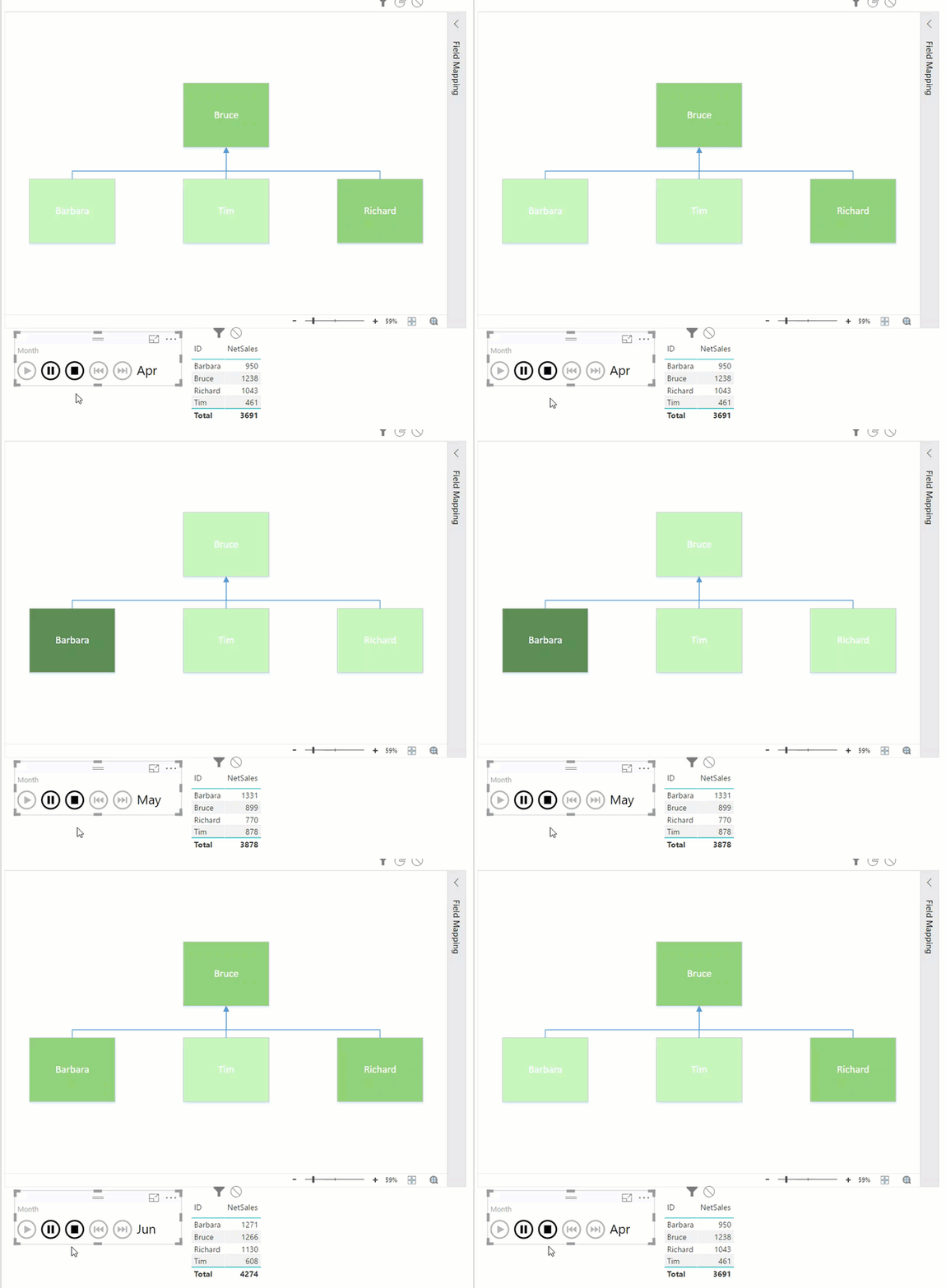
I choose three variations of the color green, where the darker the color, the better the results. This is a more color blind friendly method of representing data. Using the Play Axis custom visual, we can see the colors change when we change between months:
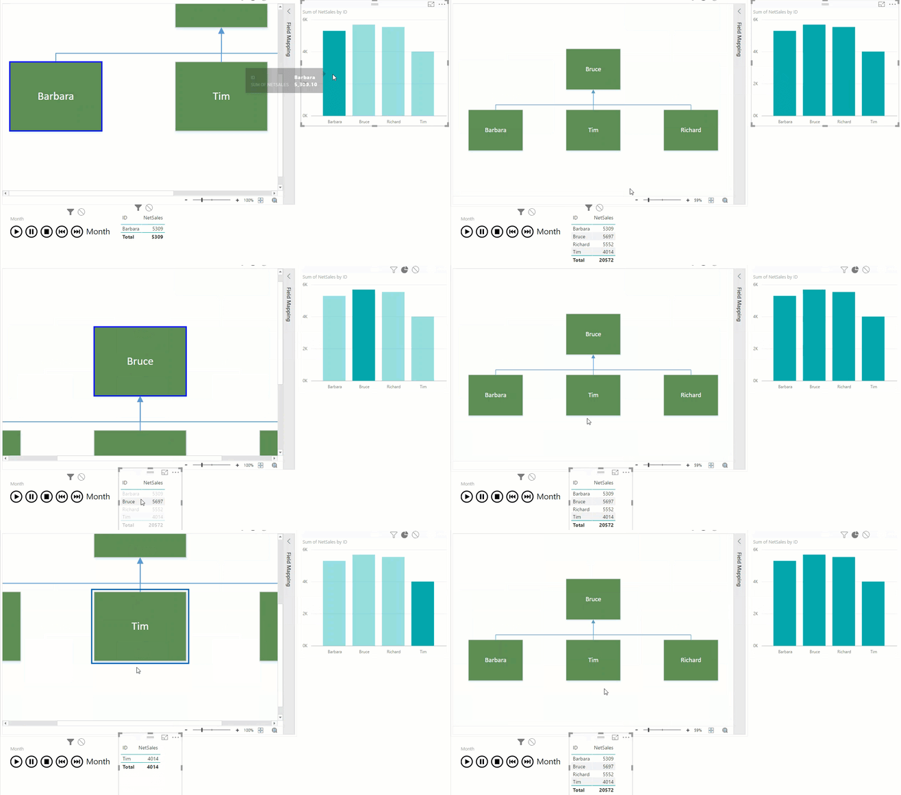
The Visio visual is also fully interactive. Clicking on other visuals will zoom to the relevant shape in the diagram. The other way around, clicking on a shape will filter all other visuals.
Now that we’ve got the diagram working, we can add a what-if scenario.
Adding What-if-Analysis
Let’s make this report a bit more interactive by adding a What-if-Analysis. In such an analysis, you can manipulate a parameter to see what an effect a value would have on your current numbers. In this example, we’re going to manipulate the discount given to customers.
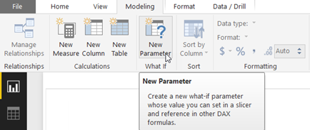
First, create a new parameter in the Modelling tab in the ribbon (keep in mind this functionality is currently only available for models with imported data and not for live sources):
In the pop-up, you can specify minimum and maximum values, as well as an increment and a default value:
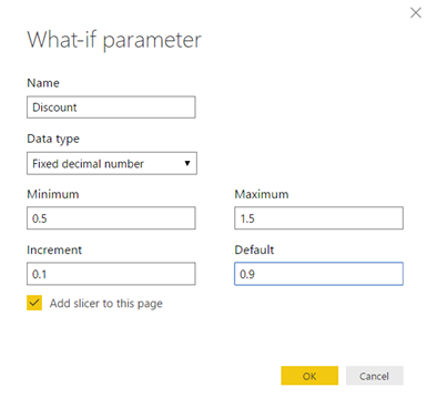
The values range between 0.5 (50% discount given) and 1.5 (50% extra invoiced to customers, for when the company becomes evil). The following objects are generated:
- A table holding all the possible values for the parameter
- A measure called Discount Value holding the current selected value of the parameter
- A slicer on the report allowing you to easily change the value of the parameter
In order to use this parameter, we adapt the NetSales measure to use the parameter value:

When we change the slicer to a play axis, we get the following analysis:
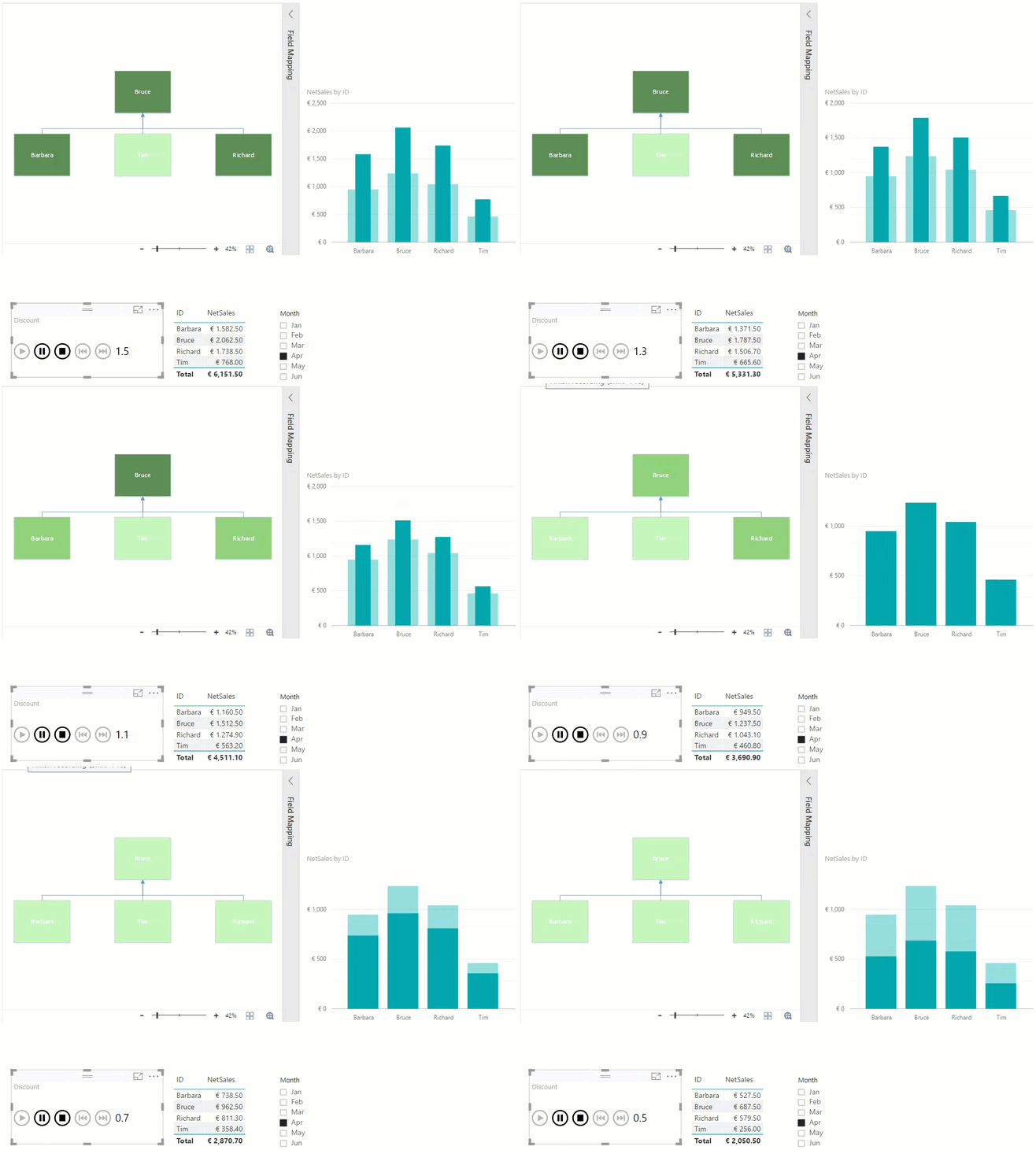
When you use highlighting on the bar chart as interaction, you can easily compare the value from the what-if scenario against the default value.
Conclusion
This blog post has shown how you relatively easy embed Visio visuals in your Power BI reports. Adding what-if analysis allows you to enrich your reports even more and gives an additional layer of interactivity.
Did you find our walk-through helpful? Share it with others!


